5分で実装♪虫眼鏡アイコンで検索フォーム表示3選❗️
💡 どのタイプを使う?選び方の目安:
- 軽量に済ませたい → A:横に伸びる(CSSのみ)
- コーポレート・ブランディングサイト → B:ふわっと浮かび上がる(JS使用)
- ブログメディア・スマホファースト → C:画面中央モーダル型(JS使用)
A:横に伸びる(CSSのみ)
See the Pen A:【CSSのみ】横に伸びる by N Katsumata (@nk-codepen) on CodePen.
コードを見る
HTML
 <form role="search" method="get" action="/search">
    <label class="search-form-label" for="search-a">
      <input id="search-a" class="search-form-input" type="search" name="q" autocomplete="off" placeholder="検索..." aria-label="サイト内検索">
      <svg class="search-form-icon" aria-hidden="true" xmlns="http://www.w3.org/2000/svg" width="24" height="24" viewBox="0 0 24 24" fill="none" stroke="#86a3a0" stroke-width="2" stroke-linecap="round" stroke-linejoin="round">
        <circle cx="11" cy="11" r="8"></circle>
        <line x1="21" y1="21" x2="16.65" y2="16.65"></line>
      </svg>
    </label>
  </form>
CSS
.search-form-label {
  position: relative;
  display: inline-block;
  flex-shrink: 0;
}

.search-form-label .search-form-icon {
  position: absolute;
  top: 50%;
  left: 17px;
  transform: translateY(-50%);
  width: 24px;
  height: 24px;
  transition: stroke 0.4s ease;
  pointer-events: none;
  fill: none;
}

.search-form-label .search-form-input {
  -webkit-appearance: none;
  appearance: none;
  box-sizing: border-box;
  width: 60px;
  height: 60px;
  padding: 20px 0 20px 60px;
  border: none;
  border-radius: 30px;
  background-color: #eaf2f1;
  transition: width 0.4s ease, padding 0.4s ease, background-color 0.4s ease, color 0.3s ease, box-shadow 0.2s ease;
  outline: none;
  cursor: pointer;
  font-size: 16px;
  line-height: normal;
  overflow: hidden;
  color: transparent;
  caret-color: transparent;
}

.search-form-label .search-form-input::placeholder {
  color: transparent;
  transition: color 0.3s ease;
  opacity: 1;
}

.search-form-label .search-form-input:focus {
  width: min(90vw, 250px);
  padding: 20px 20px 20px 50px;
  cursor: text;
  background-color: #dbece9;
  color: #123a36;
  caret-color: #123a36;
}

.search-form-label .search-form-input:focus::placeholder {
  color: #86a3a0;
}

.search-form-label:focus-within .search-form-icon {
  stroke: #2d6a63;
}

.search-form-label .search-form-input::-webkit-search-cancel-button {
  -webkit-appearance: none;
}
向いているサイト:
LP(ランディングページ)/個人ブログ/作品紹介サイト/シンプルなWordPressサイト
メリット:
JSを使わないので動作が軽い/保守が楽
デメリット:
横に広がるので設置場所によってはレイアウト崩れしやすい/スマホや狭いヘッダーだと窮屈になるため調整が必要
B:ふわっと浮かび上がる(JS使用)
See the Pen B:【JS使用】ふわっと浮かび上がる by N Katsumata (@nk-codepen) on CodePen.
コードを見る
HTML
<p>B:ふわっと浮かび上がる(JS使用)</p>
<div class="search-widget">
  <button class="search-widget-toggle" aria-label="検索フォームを開閉" aria-expanded="false">
    <svg class="search-widget-icon-open" aria-hidden="true" xmlns="http://www.w3.org/2000/svg" width="24" height="24" viewBox="0 0 24 24" fill="none" stroke="#86a3a0" stroke-width="2" stroke-linecap="round" stroke-linejoin="round">
      <circle cx="11" cy="11" r="8"></circle>
      <line x1="21" y1="21" x2="16.65" y2="16.65"></line>
    </svg>
    <svg class="search-widget-icon-close" aria-hidden="true" xmlns="http://www.w3.org/2000/svg" width="24" height="24" viewBox="0 0 24 24" fill="none" stroke="#86a3a0" stroke-width="2" stroke-linecap="round" stroke-linejoin="round">
      <line x1="18" y1="6" x2="6" y2="18"></line>
      <line x1="6" y1="6" x2="18" y2="18"></line>
    </svg>
  </button>
  <div class="search-widget-panel">
    <form class="search-widget-form" role="search" method="get" action="/search">
      <input class="search-widget-input" type="search" name="q" autocomplete="off" placeholder="キーワードを入力">
      <button class="search-widget-submit" type="submit" aria-label="検索">
        <svg aria-hidden="true" xmlns="http://www.w3.org/2000/svg" width="20" height="20" viewBox="0 0 24 24" fill="none" stroke="currentColor" stroke-width="2" stroke-linecap="round" stroke-linejoin="round">
          <circle cx="11" cy="11" r="8"></circle>
          <line x1="21" y1="21" x2="16.65" y2="16.65"></line>
        </svg>
      </button>
    </form>
  </div>
</div>
CSS
.search-widget {
  position: absolute;
  right: 20px;
  display: inline-block;
}

.search-widget-toggle {
  width: 50px;
  height: 50px;
  cursor: pointer;
  border: none;
  border-radius: 50%;
  background: #eaf2f1;
  display: flex;
  align-items: center;
  justify-content: center;
  flex-shrink: 0;
}

.search-widget-toggle:focus-visible {
  outline: none;
  box-shadow: 0 0 0 3px rgba(18, 58, 54, 0.2);
}

.search-widget-icon-close {
  display: none;
}

.search-widget-toggle.is-active .search-widget-icon-open {
  display: none;
}

.search-widget-toggle.is-active .search-widget-icon-close {
  display: inline;
}

.search-widget-panel {
  position: absolute;
  top: calc(100% + 8px);
  right: 0;
  width: 260px;
  background: #eaf2f1;
  border-radius: 12px;
  box-shadow: 0 5px 15px rgba(0, 0, 0, 0.1);
  padding: 16px;
  box-sizing: border-box;
  opacity: 0;
  transform: translateY(-6px);
  pointer-events: none;
  transition: opacity 0.4s ease, transform 0.4s ease;
}

.search-widget-panel.is-open {
  opacity: 1;
  transform: translateY(0);
  pointer-events: auto;
}

.search-widget-form {
  display: flex;
  align-items: center;
  border-bottom: 2px solid #86a3a0;
}

.search-widget-form:focus-within {
  border-bottom-color: #2d6a63;
}

.search-widget-input {
  -webkit-appearance: none;
  appearance: none;
  outline: none;
  width: 100%;
  flex-grow: 1;
  border: none;
  height: 46px;
  background: transparent;
  padding: 0 10px;
  font-size: 16px;
  color: #123a36;
  caret-color: #2d6a63;
  box-sizing: border-box;
}

.search-widget-input::placeholder {
  color: #86a3a0;
  opacity: 1;
}

.search-widget-submit {
  -webkit-appearance: none;
  appearance: none;
  outline: none;
  flex-shrink: 0;
  width: 46px;
  height: 46px;
  border: none;
  background: transparent;
  display: flex;
  align-items: center;
  justify-content: center;
  cursor: pointer;
  color: #2d6a63;
  box-sizing: border-box;
}

.search-widget-input::-webkit-search-cancel-button {
  -webkit-appearance: none;
}
JavaScript(Vanilla JS)
document.addEventListener("DOMContentLoaded", () => {
  const toggle = document.querySelector(".search-widget-toggle");
  const panel = document.querySelector(".search-widget-panel");
  const input = document.querySelector(".search-widget-input");
  if (!(toggle && panel && input)) return;

  toggle.addEventListener("click", (e) => {
    e.stopPropagation();
    const isOpen = panel.classList.toggle("is-open");
    toggle.classList.toggle("is-active");
    toggle.setAttribute("aria-expanded", isOpen);
    if (isOpen) input.focus();
  });

  document.addEventListener("click", (e) => {
    if (!toggle.closest(".search-widget").contains(e.target)) {
      panel.classList.remove("is-open");
      toggle.classList.remove("is-active");
      toggle.setAttribute("aria-expanded", "false");
    }
  });

  document.addEventListener("keydown", (e) => {
    if (e.key === "Escape" && panel.classList.contains("is-open")) {
      panel.classList.remove("is-open");
      toggle.classList.remove("is-active");
      toggle.setAttribute("aria-expanded", "false");
      toggle.focus();
    }
  });
});
※ ヘッダーなど親要素に position: relative がある場合はそのままお使いいただけます。.search-widget の position: absolute と right: 20px は設置場所に合わせて調整してください。
向いているサイト:
コーポレートサイト/サービスサイト/ブランディングサイト/メニューを圧迫したくないサイト
メリット:
既存のレイアウトを壊さずに設置できる/自動フォーカスされるためクリック後の検索がしやすい(UX改善に繋がる)
デメリット:
実装・保守コストが少し増える
C:画面中央モーダル型(JS使用)
See the Pen C:画面中央モーダル型(JS使用) by N Katsumata (@nk-codepen) on CodePen.
コードを見る
HTML
<div class="search-modal">
  <button class="search-modal-toggle" aria-label="検索を開く" aria-expanded="false">
    <svg class="search-modal-icon" aria-hidden="true" xmlns="http://www.w3.org/2000/svg" width="24" height="24" viewBox="0 0 24 24" fill="none" stroke-width="2" stroke-linecap="round" stroke-linejoin="round">
      <circle cx="11" cy="11" r="8"></circle>
      <line x1="21" y1="21" x2="16.65" y2="16.65"></line>
    </svg>
  </button>
  <div class="search-modal-overlay">
    <div class="search-modal-content">
      <button class="search-modal-close" aria-label="検索を閉じる">×</button>
      <form role="search" method="get" action="/search">
        <input class="search-modal-input" type="search" name="q" autocomplete="off" placeholder="キーワード検索">
        <button type="submit" aria-label="検索する">検索</button>
      </form>
    </div>
  </div>
</div>
CSS
.search-modal-toggle {
  width: 50px;
  height: 50px;
  border: none;
  border-radius: 50%;
  background: #eaf2f1;
  cursor: pointer;
  display: flex;
  align-items: center;
  justify-content: center;
}

.search-modal-toggle:focus-visible {
  outline: none;
  box-shadow: 0 0 0 3px rgba(18, 58, 54, 0.2);
}

.search-modal-icon {
  stroke: #86a3a0;
  fill: none;
}

.search-modal-overlay {
  position: fixed;
  inset: 0;
  z-index: 999;
  background: rgba(0, 0, 0, 0.5);
  display: flex;
  align-items: center;
  justify-content: center;
  opacity: 0;
  visibility: hidden;
  transition: opacity 0.3s ease, visibility 0.3s ease;
}

.search-modal-overlay.is-open {
  opacity: 1;
  visibility: visible;
}

.search-modal-content {
  position: relative;
  width: min(90%, 600px);
  padding: 60px 40px 40px;
  border-radius: 16px;
  background: #fff;
  transform: translateY(20px);
  transition: transform 0.3s ease;
}

.search-modal-overlay.is-open .search-modal-content {
  transform: translateY(0);
}

.search-modal-close {
  position: absolute;
  top: 10px;
  right: 10px;
  border: none;
  background: transparent;
  cursor: pointer;
  font-size: 32px;
  line-height: 1;
  color: #86a3a0;
}

.search-modal-content form {
  display: flex;
  gap: 10px;
}

.search-modal-content input {
  -webkit-appearance: none;
  appearance: none;
  width: 100%;
  height: 50px;
  padding: 0 16px;
  border: 1px solid #86a3a0;
  border-radius: 8px;
  outline: none;
  font-size: 16px;
  color: #123a36;
  caret-color: #2d6a63;
  box-sizing: border-box;
}

.search-modal-content input:focus {
  border-color: #2d6a63;
}

.search-modal-input::placeholder {
  color: #86a3a0;
  opacity: 1;
}

.search-modal-content button[type="submit"] {
  -webkit-appearance: none;
  appearance: none;
  flex-shrink: 0;
  height: 50px;
  padding: 0 20px;
  border: none;
  border-radius: 8px;
  background: #2d6a63;
  color: #fff;
  cursor: pointer;
  font-size: 16px;
}

.search-modal-input::-webkit-search-cancel-button {
  -webkit-appearance: none;
}
JavaScript(Vanilla JS)
document.addEventListener("DOMContentLoaded", () => {
  const openBtn = document.querySelector(".search-modal-toggle");
  const closeBtn = document.querySelector(".search-modal-close");
  const modal = document.querySelector(".search-modal-overlay");
  const searchInput = document.querySelector(".search-modal-input");
  if (!(openBtn && closeBtn && modal && searchInput)) return;

  const openModal = () => {
    modal.classList.add("is-open");
    openBtn.setAttribute("aria-expanded", "true");
    searchInput.focus();
  };

  const closeModal = () => {
    modal.classList.remove("is-open");
    openBtn.setAttribute("aria-expanded", "false");
    openBtn.focus();
  };

  openBtn.addEventListener("click", openModal);
  closeBtn.addEventListener("click", closeModal);

  modal.addEventListener("click", ({ target }) => {
    if (target === modal) closeModal();
  });

  document.addEventListener("keydown", ({ key }) => {
    if (key === "Escape" && modal.classList.contains("is-open")) closeModal();
  });
});
向いているサイト:
メディアサイト/ECサイト/記事数が多いブログ/カテゴリ数や記事数が多く検索利用が多いサイト/スマホ閲覧が多いサイト
メリット:
スマホでも入力しやすい/そのままレスポンシブになる/背景暗転で入力対象が明確になる
デメリット:
頻繁に検索するサービスでは操作回数が増え、使いづらい場合がある
【ステップアップ】自分好みにカスタマイズしよう💡
色を変更したい(ブランドカラーに合わせたい)
CSSのカラーコードを目安に適宜ご変更いただけます。Visual Studio Codeなどのエディターの場合、小さな窓でコード内の色が表示されます。
もしSVGコードを変更した(=アイコンを入れ替えた)場合は、新しいSVGコード内にこれまで使用されていたクラスを追加するのを忘れないでください。
<svg class="search-form-icon" aria-hidden="true" xmlns="http://www.w3.org/2000/svg" width="24" height="24" viewBox="0 0 24 24" fill="none" stroke="#86a3a0" stroke-width="2" stroke-linecap="round" stroke-linejoin="round">
<circle cx="11" cy="11" r="8"></circle>
<line x1="21" y1="21" x2="16.65" y2="16.65"></line>
</svg>
入力履歴をONにしたい
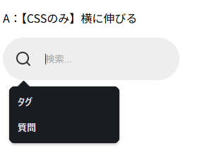
通常は非表示にすることの多いinputの入力履歴(オートコンプリート)ですが、表示したい場面があるかもしれないので、その場合は以下のinput要素の「autocomplete=”off”」のところを「on」にしてください。
<input class="search-widget-input" type="search" name="q" autocomplete="off" placeholder="キーワードを入力">
↓
<input class="search-widget-input" type="search" name="q" autocomplete="on" placeholder="キーワードを入力">
この入力履歴(オートコンプリート)は、ブラウザ設定やname属性などの条件によって表示されます。
WordPressでも「name=”s”」などが入ることも多いため、うまく動かない場合は「name=”q”」が本当は「name=”s”」ではないかなど確認してください。
【Q&A】よくあるトラブルと解決策 🛠️
Q:動きの速さを変えたいです
速度調整ならCSSの以下を調整:
A:横に伸びる
- 該当のクラス:search-form-input
- 該当のコード:transition: width 0.4s ease, padding 0.4s ease;
- 素早く:2個所「0.4」を「0.2」にする
- 優雅に:2個所「0.4」を「0.5」にする
B:ふわっと浮かび上がる
- 該当のクラス:search-widget-panel
- 該当のコード:transition: opacity 0.4s, transform 0.4s;
- 素早く:2個所「0.4」を「0.3」にする
- 優雅に:2個所「0.4」を「0.6」にする
C:画面中央モーダル型
- 該当のクラス:search-modal-overlay
- 該当のコード:transition: opacity 0.3s ease, visibility 0.3s ease;
- 素早く:2個所「0.3」を「0.2」にする
- 優雅に:2個所「0.3」を「0.6」にする
Q:動きません…
JavaScriptのクラス名とHTMLのクラス名が一致しているか確認してください。1文字違うだけでも動かなくなります。
また、コピペしたコードを貼り付けた位置や「document.addEventListener(“DOMContentLoaded”, () => {」が重複していないかも確認してください。
この「document.addEventListener(“DOMContentLoaded”, () => {」は既存コードへ追記する場合は管理しづらくなるため、1つにまとめた方が保守しやすくなります。
✅ おすすめの例(1つにまとめる)
document.addEventListener("DOMContentLoaded", () => {

  // --- タイプBの処理 ---
  const toggleB = document.querySelector(".search-widget-toggle");
  // ...(中身を書く)

  // --- タイプCの処理 ---
  const toggleC = document.querySelector(".search-modal-toggle");
  // ...(中身を書く)

}); // 最後に1回だけ閉じる
【ポイント解説】ここだけは抑えておきたい!✏️
検索フォームではinputにfocus() をつける
この記事で紹介している、タイプB・Cのコードには含まれているのですが、自分でコードを組む際にはJavaScriptに「inputにfocus()」を加えることで、検索フォームを表示した際にすぐ文字入力できるようになります。
searchInput.focus();もし無い場合は「クリック→フォーム表示→もう一度クリック→入力開始」となり、地味にストレスを感じてしまいます。
フォームが関わる場所はブラウザのデフォルトスタイルに気をつける
実はAの伸びるタイプではinputタグ「type=”search”」を使用しているため、デフォルトでは以下のようにややグラデーションかかった青いバツマークが表示されてしまいます。
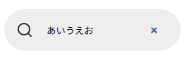
この記事のコードではこれを制御するCSSを追加していますが、同じ色のサイト以外は世界観を崩す要因にもなりますので、<form>が関わるパーツは必ずブラウザ側で用意されたスタイルが適用されることを忘れずコーディング設計してくださいね。
モーダルウィンドウは「閉じやすさ」を設計に入れる
例えばCのモーダル型では、実務でそのまま使えるように
- ×ボタンで閉じる
- 背景クリックで閉じる
- ESCキーで閉じる
まで対応したコードにしています。ややコードが煩雑になりますが、入力中の流れのまま、Escキーで検索画面を閉じられる利便性は、実務のサイト設計でも取り入れて損はありません。この記事ではそのコードも含んでいますので安心してご使用ください。
もしよろしければ、他のコピペシリーズもご覧くださいね 👇️